

Victonia Beratungsgesellschaft mbH
Brand identity and corporate design
Industry: Finance & banking
Victonia Beratungsgesellschaft mbH helps institutional investors select and manage complex financial products. Its identity had to convey stability and respectability without falling back on the worn-out design patterns and colours of the financial sector. We built the brand and developed the corporate design. It is distinctive and easy to recognise, and it still looks respectable.
Services
Result
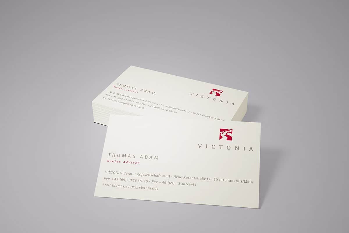
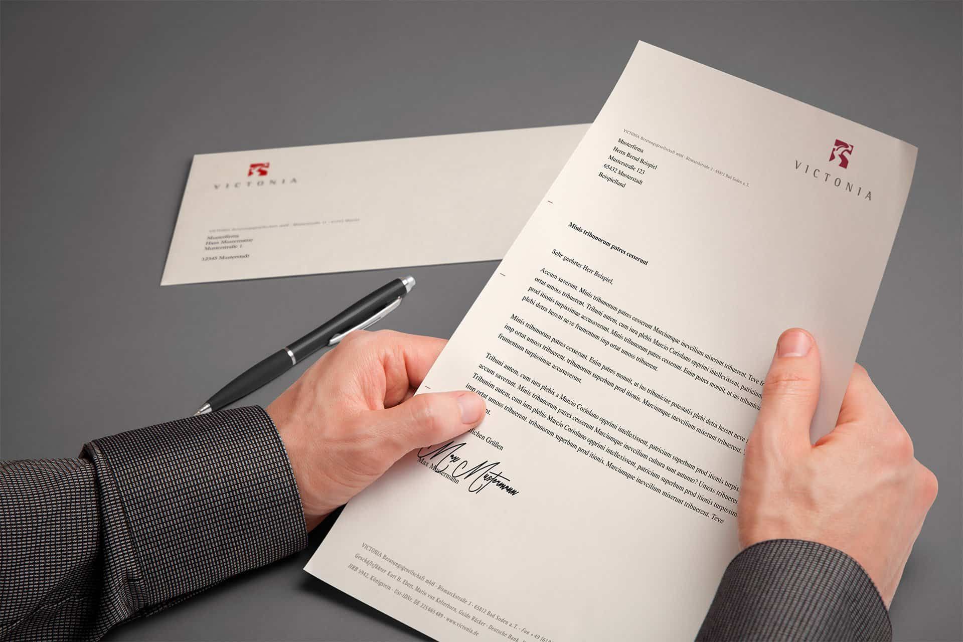
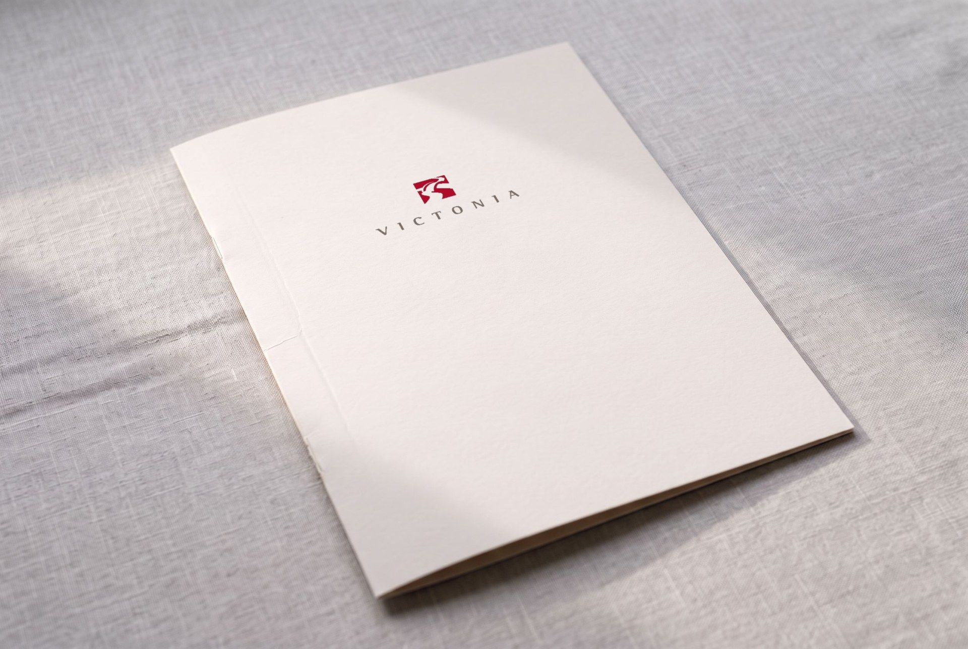
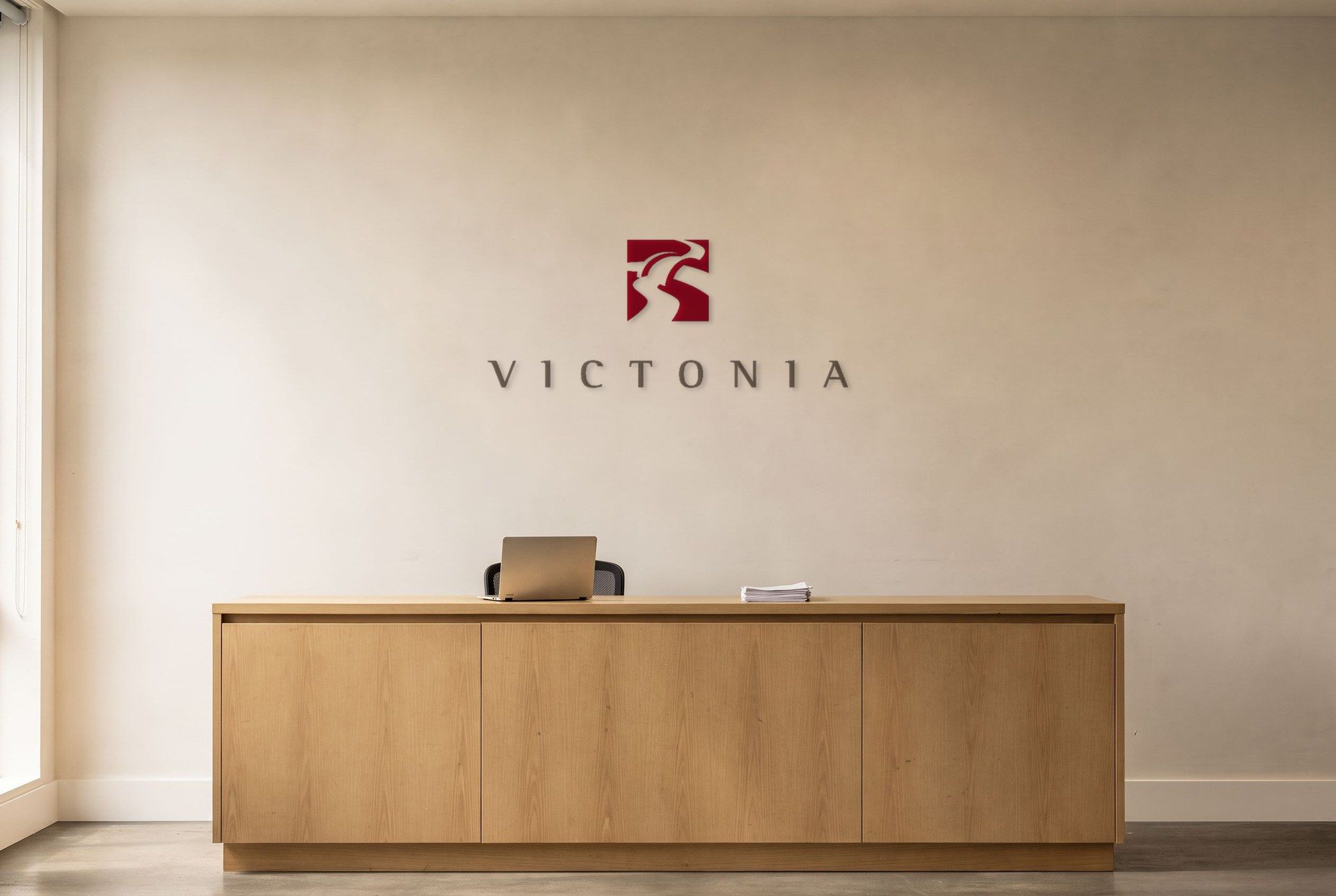
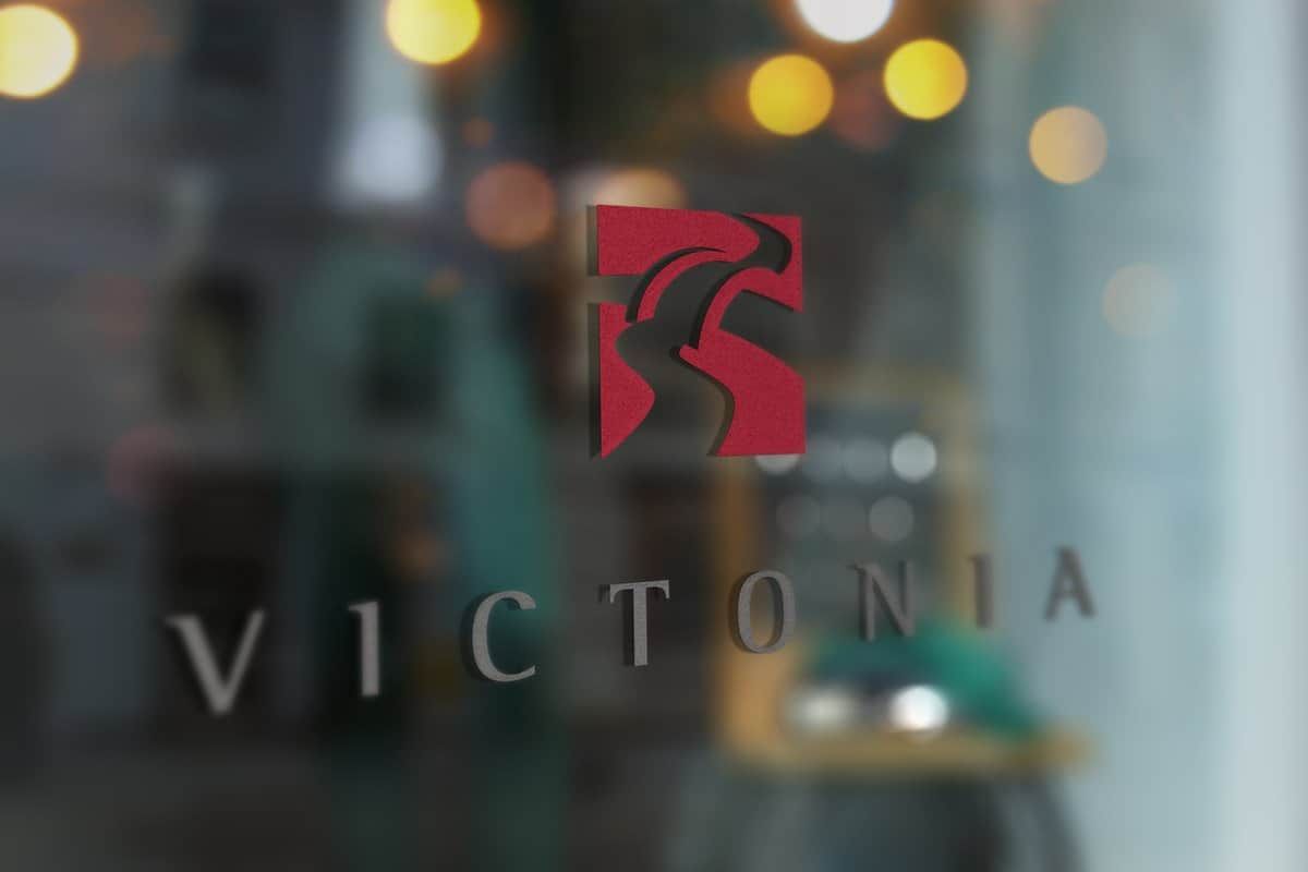
The central element is a bridge reduced to its essentials. It sits as a red mark above the wordmark in widely spaced capitals, on the letterhead and business cards as well as on the glass door of the office.
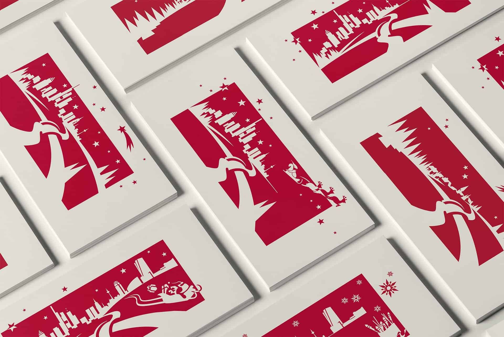
The same motif appears on the Christmas cards, which we redesign every year. In fact, we design all of Victonia's communication materials, from printed matter to the signage in the office.
Brand colours
- RedBridge mark#BA0C2FRGB 186 12 47
- Cream whitePaper and cards#F2EBE3RGB 242 235 227
- Light greyRules and surfaces#CDC9C5RGB 205 201 197
- Warm greyWordmark and text#83786FRGB 131 120 111

Questions about this project or a new one
More than 900 projects since 2000. Room for one more.
Send us an email or give us a call. A few sentences about your plans are enough to start with.